Jonathan McFarland / Visual Communications Emphasis
A designer is part historian, part architect, part mechanic, part geologist, part anthropologist, part counselor, part physicist, part linguist, part kinesiologist, part God, part philosopher, part human.
This was a list I scribbled down on the back of a receipt as I was driving from San Diego to Granite Bay, CA for Christmas this last break. It was something that I had come to realize after a long creative week in San Diego working with my friends at Dirtywurx's and an even longer fall semester. But let me back up to where these ideas came from.
This last semester I was working my fingers to the bone and burning the candle at both ends everyday. I wanted to kill it last semester and really push myself as a designer using my communication skills, and personal style. Some days I would think to myself, "Why? Why do I push my self so hard?." It always came down to: "How bad do I want it?." Are you willing to give up sleep?; willing to spend countless days in order for things to be perfect? How bad to you want be a successful designer? I found out if you really want to be successful --if you really want it bad enough-- then you've got to be willing to give up sleep, stay up for three days in a row, and forget to eat so you can make dreams become a reality and not let vision disappear.
Last semester for experimental typography these ideas, these emotions, and this mind set were never truer. I set my goal to make a music video for the moving typography assignment. My friends at Dirtywurx remixed a song for me; and, from that, I made a vision for my video. However, for my vision to become a reality, I had to learn a whole new software --Cinema4d. I had never touched a 3d rendering software, and had no one clue how to even open a new document. It didn't matter because I had the desire to learn. I spend countless days and night teaching myself everything. I had an opportunity to make my dream a reality --I wanted that reward of success. Making this video has pulled together a lot of my talents as a designer. I would use Adobe Illustrator to set up majority of my layouts that would then translate into moving type in Cinema4d. I not only had to know how to make an effective design in order to communicate my message, but also how a flat image would then become a 3d moving object that would interact with principles like gravity. Working with this program has really changed my way of thinking about design. All my knowledge and observations about how things work in the world can now be used to develop my design skills. I can use these observations to make stronger communication objects that are full of information and meaning. It's no longer just a design I make on a computer screen that looks cool, but it's more of a holistic view as to how a communication design project should be tackled. Now, in order for me to make good work, the design must hold a lot of depth and be full of information. That's where the list comes together to express me as a graphic communicator.
A designer is part historian, part architect, part mechanic, part
geologist, part anthropologist, part counselor, part physicist, part
linguist, part kinesiologist, part God, part philosopher, part human.
I'm sure this list could be expanded on by myself and others, but the idea is that all this knowledge can be put together to make fuller, more impacting design projects.

List of Works
1
Title: Powder Mountain
Medium: Digital Print
Size: 14" x 11"
Date: Fall 2011
Description: Self directed. This type design poster was inspired by an early season trip to Powder Mountain Resort and while looking at the environment I thought about the history of this area; how ancient ruins could easily be spilled across such a spiritual environment like those seen on mountain tops across the world. Digital photography and typography built in Cinema4d.
2
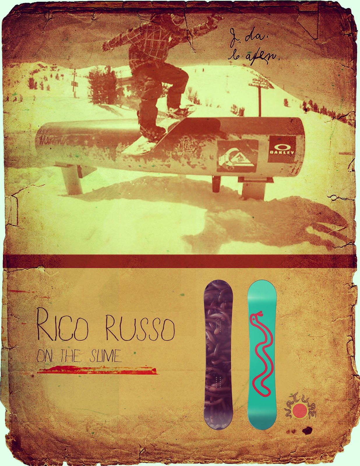
Title: Nature Boards
Medium: Digital Print
Size: Various
Date: Fall 2011
Description: Visual Communication. This is a series of a re-branding campaign we did for the Nature Company. My passion for snowboarding and my dream of designing snowboards moved the development of the Nature Company into a new brand: Nature Snowboards.
3
Title: Clean Water is Power
Medium: Digital Print
Size: 14" x 11"
Date: Spring 2012
Description: Advanced Design. For this assignment we tackled global wicked problems. This info graphic shows that the flow of our water is between every country. Also, we have a real problem with water diseases and this info graphic describes the vast number of annual water disease episodes that are caused by unclean water that we all share.
4
Title: 1152 Elephant Brain Design
Medium: Digital Print
Size: 11" x 14"
Date: Fall 2011
Description: Self Directed. As designers we need to make an identity and this poster is part of an ongoing project to build my identity as a designer. Much of the inspiration comes from my experience in the action sports environment and it spills over into this identity poster through my use of color and typography.
5
Title: The Shining
Medium: Printed Book
Size: 6" x 8.5"
Date: Fall 2011
Description: Experimental Typography. Designing an entire book has always been a goal of mine, but I never thought the first book would turn out like this. Inspired by the movie "The Shining", this grim, texture rich, emotional book uses typography as a vessel to transpire many emotions. It was entirely written and drawn on my 1950's Olympia SM4 typewriter.
6
Title: Errbody
Medium: Video, Digital Print
Size: Various
Date: Fall 2011
Description: Experimental Typography. In my goal to further myself as a graphic communicator and make myself more marketable, I wanted to learn a 3d rendering program. I found the software Cinema4d and taught myself the program for this assignment. For this we were to take a song and make a type motion video. With my song in hand and vision in mind, I had my buddy from Dirtywurx re-mix "Everybodys Talking at Me" by Harry Nilsson so that I could fully develop this music video. It is something that is still in progress but the knowledge built from this assignment is unmeasurable.
7
Title: Mac5
Medium: Digital Print
Size: 17" x 10"
Date: Spring 2012
Description: Self Directed. As part of developing my skills within Cinema4d and also to help display my skills as a designer I built this "M" city in the sky. This was actually inspired by Lando Calrissian's Cloud City from Star Wars Episode V: The Empire Strikes Back. I wanted my own city within the clouds.
8
Title: Handsome Indian, Manhattan Beach
Medium: Digital Print
Size: 17" x 24"
Date: Spring 2012
Description: Design History. These posters are from a typophoto assignment in which we were to merit typography with photography as did early designers.
9
Title: HCOP Promotional Poster, HCOP Logo
Medium: Digital Print
Size: 11" x 17", 17" x 11"
Date: Fall 2011
Description: Visual Communication. HCOP (Health Careers Opportunity Program) asked our class to develop a logo for their outreach program. I wanted my logo to describe what they are (a health industry program) as well show that they care (a heart). These two symbols married together speak my idea as one symbol. As a bonus I developed an inspiring poster that they could use to give more information about their program as well as spark interest within their student audience.
10
Title: Location 1,2,3
Medium: Digital Print
Size: 10" x 17"
Date: Fall 2011
Description: Self Directed. As I was transitioning between California and Utah this last semester, I was doing a lot of traveling and thinking. At this time I was flaring my creative mind back up to gear up for the upcoming semester and the rest of my graphic art career. These pictures snapshot moments of movement, realizations, and tragedy.
11
Title: Here I Come
Medium: Digital Print
Size: 17" x 24"
Date: Spring 2012
Description: Design History. This piece was actually part of the typophoto assignment listed above, but I felt it should have it's own listing, since it is very different than the others. Inspired by my use in Cinema4d and horror movies like, The Exorcist, Childs Play, and one I'm developing called Killer Babies; this piece expresses my love for playful typography while using photography skills like perspective, and leading lines.
Title: Powder Mountain
Medium: Digital Print
Size: 14" x 11"
Date: Fall 2011
Description: Self directed. This type design poster was inspired by an early season trip to Powder Mountain Resort and while looking at the environment I thought about the history of this area; how ancient ruins could easily be spilled across such a spiritual environment like those seen on mountain tops across the world. Digital photography and typography built in Cinema4d.
2
Title: Nature Boards
Medium: Digital Print
Size: Various
Date: Fall 2011
Description: Visual Communication. This is a series of a re-branding campaign we did for the Nature Company. My passion for snowboarding and my dream of designing snowboards moved the development of the Nature Company into a new brand: Nature Snowboards.
3
Title: Clean Water is Power
Medium: Digital Print
Size: 14" x 11"
Date: Spring 2012
Description: Advanced Design. For this assignment we tackled global wicked problems. This info graphic shows that the flow of our water is between every country. Also, we have a real problem with water diseases and this info graphic describes the vast number of annual water disease episodes that are caused by unclean water that we all share.
4
Title: 1152 Elephant Brain Design
Medium: Digital Print
Size: 11" x 14"
Date: Fall 2011
Description: Self Directed. As designers we need to make an identity and this poster is part of an ongoing project to build my identity as a designer. Much of the inspiration comes from my experience in the action sports environment and it spills over into this identity poster through my use of color and typography.
5
Title: The Shining
Medium: Printed Book
Size: 6" x 8.5"
Date: Fall 2011
Description: Experimental Typography. Designing an entire book has always been a goal of mine, but I never thought the first book would turn out like this. Inspired by the movie "The Shining", this grim, texture rich, emotional book uses typography as a vessel to transpire many emotions. It was entirely written and drawn on my 1950's Olympia SM4 typewriter.
6
Title: Errbody
Medium: Video, Digital Print
Size: Various
Date: Fall 2011
Description: Experimental Typography. In my goal to further myself as a graphic communicator and make myself more marketable, I wanted to learn a 3d rendering program. I found the software Cinema4d and taught myself the program for this assignment. For this we were to take a song and make a type motion video. With my song in hand and vision in mind, I had my buddy from Dirtywurx re-mix "Everybodys Talking at Me" by Harry Nilsson so that I could fully develop this music video. It is something that is still in progress but the knowledge built from this assignment is unmeasurable.
7
Title: Mac5
Medium: Digital Print
Size: 17" x 10"
Date: Spring 2012
Description: Self Directed. As part of developing my skills within Cinema4d and also to help display my skills as a designer I built this "M" city in the sky. This was actually inspired by Lando Calrissian's Cloud City from Star Wars Episode V: The Empire Strikes Back. I wanted my own city within the clouds.
8
Title: Handsome Indian, Manhattan Beach
Medium: Digital Print
Size: 17" x 24"
Date: Spring 2012
Description: Design History. These posters are from a typophoto assignment in which we were to merit typography with photography as did early designers.
9
Title: HCOP Promotional Poster, HCOP Logo
Medium: Digital Print
Size: 11" x 17", 17" x 11"
Date: Fall 2011
Description: Visual Communication. HCOP (Health Careers Opportunity Program) asked our class to develop a logo for their outreach program. I wanted my logo to describe what they are (a health industry program) as well show that they care (a heart). These two symbols married together speak my idea as one symbol. As a bonus I developed an inspiring poster that they could use to give more information about their program as well as spark interest within their student audience.
10
Title: Location 1,2,3
Medium: Digital Print
Size: 10" x 17"
Date: Fall 2011
Description: Self Directed. As I was transitioning between California and Utah this last semester, I was doing a lot of traveling and thinking. At this time I was flaring my creative mind back up to gear up for the upcoming semester and the rest of my graphic art career. These pictures snapshot moments of movement, realizations, and tragedy.
11
Title: Here I Come
Medium: Digital Print
Size: 17" x 24"
Date: Spring 2012
Description: Design History. This piece was actually part of the typophoto assignment listed above, but I felt it should have it's own listing, since it is very different than the others. Inspired by my use in Cinema4d and horror movies like, The Exorcist, Childs Play, and one I'm developing called Killer Babies; this piece expresses my love for playful typography while using photography skills like perspective, and leading lines.
1 McFarland BFA: Powder Mountain
 Title: Powder Mountain
Medium: Digital Print
Size: 14" x 11"
Date: Fall 2011
Description: Self directed. This type design poster was inspired by an early season trip to Powder Mountain Resort and while looking at the environment I thought about the history of this area; how ancient ruins could easily be spilled across such a spiritual environment like those seen on mountain tops across the world. Digital photography and typography built in Cinema4d.
2 McFarland BFA: Nature Boards

Medium: Digital Print
Size: Various
Date: Fall 2011
Description: Visual Communication. This series is of a re-branding campaign we did for the Nature Company. My passion for snowboarding and my dream of designing snowboards moved the development of the Nature Company into a new brand: Nature Snowboards.


3 McFarland BFA: Clean Water Is Power
 Title: Clean Water is Power
 Medium: Digital Print
Size: 14" x 11"
Date: Spring 2012
Description: Advanced Design. For this assignment we tackled global wicked problems. This info graphic shows that the flow of our water is between every country. Also, we have a real problem with water diseases and this info graphic describes the vast number of annual water disease episodes that are caused by unclean water that we all share.
4 McFarland BFA: 1152 Elephant Brain Design

Medium: Digital Print
Size: 11" x 14"
Date: Fall 2011
Description: Self Directed. As designer we need to make an identity and this poster is part of an ongoing project to build my identity as a designer. Much of the inspiration comes from my experience in the action sports environment and it spills over into this identity poster through my use of color and typography.
5 McFarland BFA: The Shining
 Title: The Shining
Medium: Printed Book
Size: 6" x 8.5"
Date: Fall 2011
Description: Experimental Typography. Designing an entire book has always been a goal of mine, but I never thought the first book would turn out like this. Inspired by the movie "The Shining", this grim, texture rich, emotional book uses typography as a vessel to transpire many emotions. It was entirely written and drawn on my 1950's Olympia SM4 typewriter.


6 McFarland BFA: Errbody
Title: Errbody
Medium: Video, Digital Print
Size: Various
Date: Fall 2011
Description: Experimental Typography. In my goal to further
myself as a graphic communicator and make myself more marketable, I
wanted to learn a 3d rendering program. I found the software Cinema4d
and taught myself the program for this assignment. For this assignment I took a song and made a type motion video. With my song in hand and
vision in mind, I had my buddy from Dirtywurx re-mix "Everybodys Talking
at Me" by Harry Nilsson so that I could fully develop this music
video. It is something that is still in progress but the knowledge
built from this assignment is unmeasurable.
(double click videos to view in YouTube)
1st Video: first half in higher quality
2nd Video: full length but not good quality
3rd Video: best quality and how its going to look but small clip.


7 McFarland BFA: Mac5
 Title: Mac5
Medium: Digital Print
Size: 17" x 10"
Date: Spring 2012
Description: Self Directed. As part of developing my skills within Cinema4d and also to help display my skills as a designer I built this "M" city in the sky. This was actually inspired by Lando Calrissian's Cloud City from Star Wars Episode V: The Empire Strikes Back. I wanted my own city within the clouds.
8 McFarland BFA: Handsome Indian, Manhattan Beach


Title: Handsome Indian, Manhattan Beach
Medium: Digital Print
Size: 17" x 24"
Date: Spring 2012
Description: Design History. These posters are from a typophoto assignment in which we were to merit typography with photography as did early designers.
9 McFarland BFA: HCOP Promotional Poster, HCOP Logo


Title: HCOP Promotional Poster, HCOP Logo
Medium: Digital Print
Size: 11" x 17", 17" x 11"
Date: Fall 2011
Description: Visual Communication. HCOP (Health Careers Opportunity Program) asked our class to develop a logo for their outreach program. I wanted my logo to describe what they are (a health industry program) as well show that they care (a heart). These two symbols married together speak my idea as one symbol. As a bonus I developed an inspiring poster that they could use to give more information about their program as well as spark interest within their student audience.
10 McFarland BFA: Location 1, 2, 3


Title: Location 1,2,3
Medium: Digital Print
Size: 10" x 17"
Date: Fall 2011
Description: Self Directed. As I was transitioning between California and Utah this last semester, I was doing a lot of traveling and thinking. At this time I was flaring my creative mind back up to gear up for the upcoming semester and the rest of my graphic art career. These pictures snapshot moments of movement, realizations, and tragedy.
11 McFarland BFA: Here I Come

Medium: Digital Print
Size: 17" x 24"
Date: Spring 2012
Description: Design History. This piece was actually part of the typophoto assignment listed above, but I felt it should have its own listing, since it is very different than the others. Inspired by my use in Cinema4d and horror movies like, The Exorcist, Childs Play, and one I'm developing called Killer Babies; this piece expresses my love for playful typography while using photography skills like perspective, and leading lines.


Subscribe to:
Posts (Atom)